The Client
Tri-Ef Photo School is a new Photography school started by experienced professionals and aimed at photography enthusiasts who wish to enhance their knowledge and skills, both theoretically and practically.
The Objective
To develop an identity that will stand out amongst the competition and communicate the educational program.
The Solution
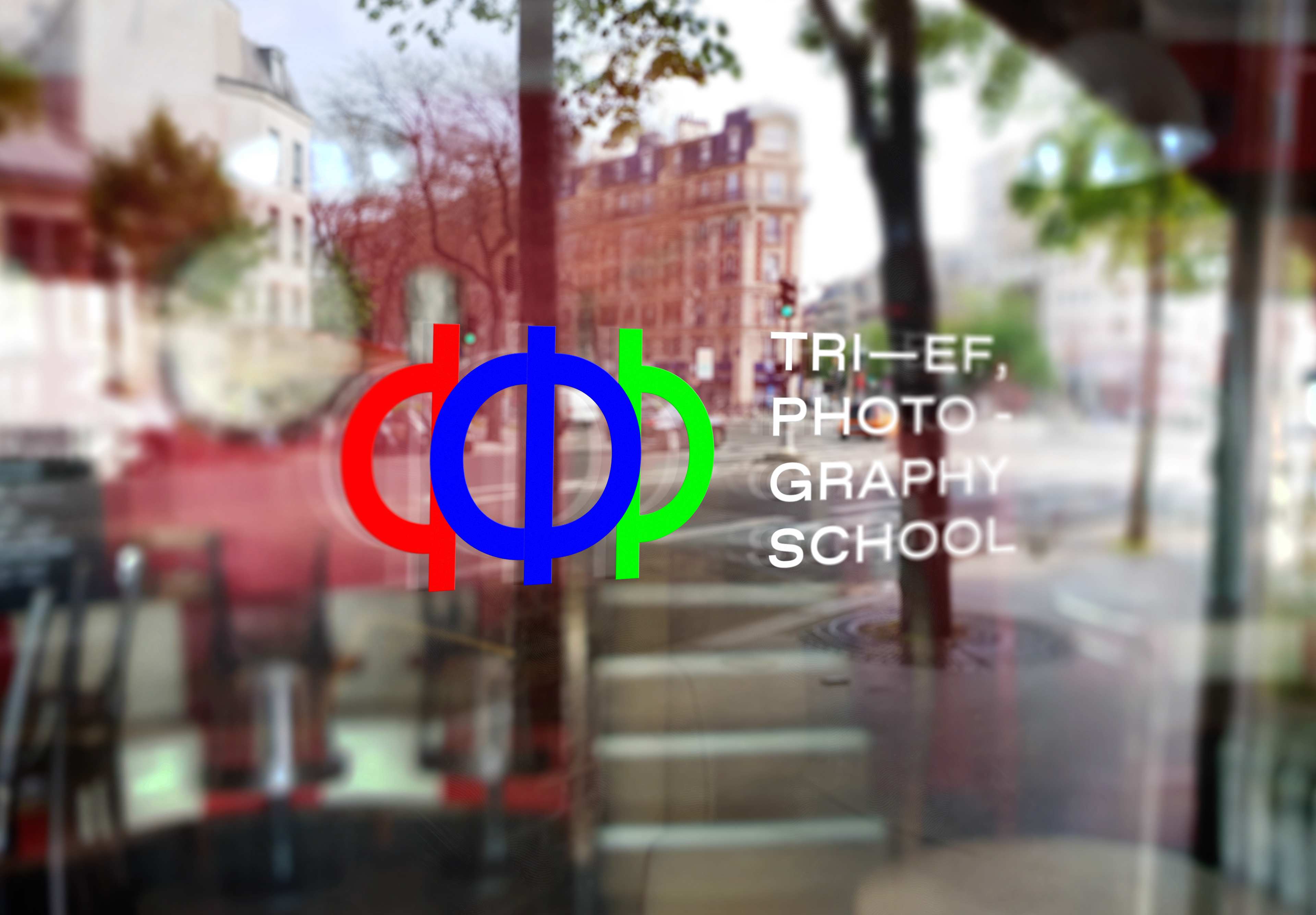
Tri-Ef founders duo and their teachers strongly believe that well executed Photography is the one where Form follows Function. I narrowed down this crucial principle to its essence: FFF.
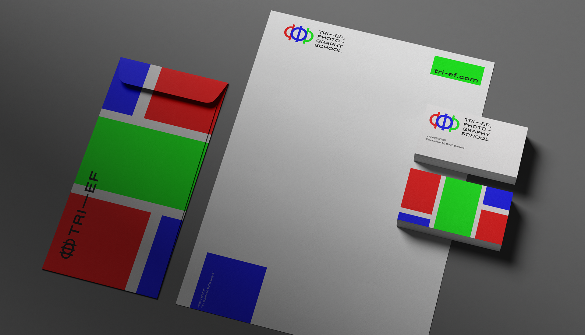
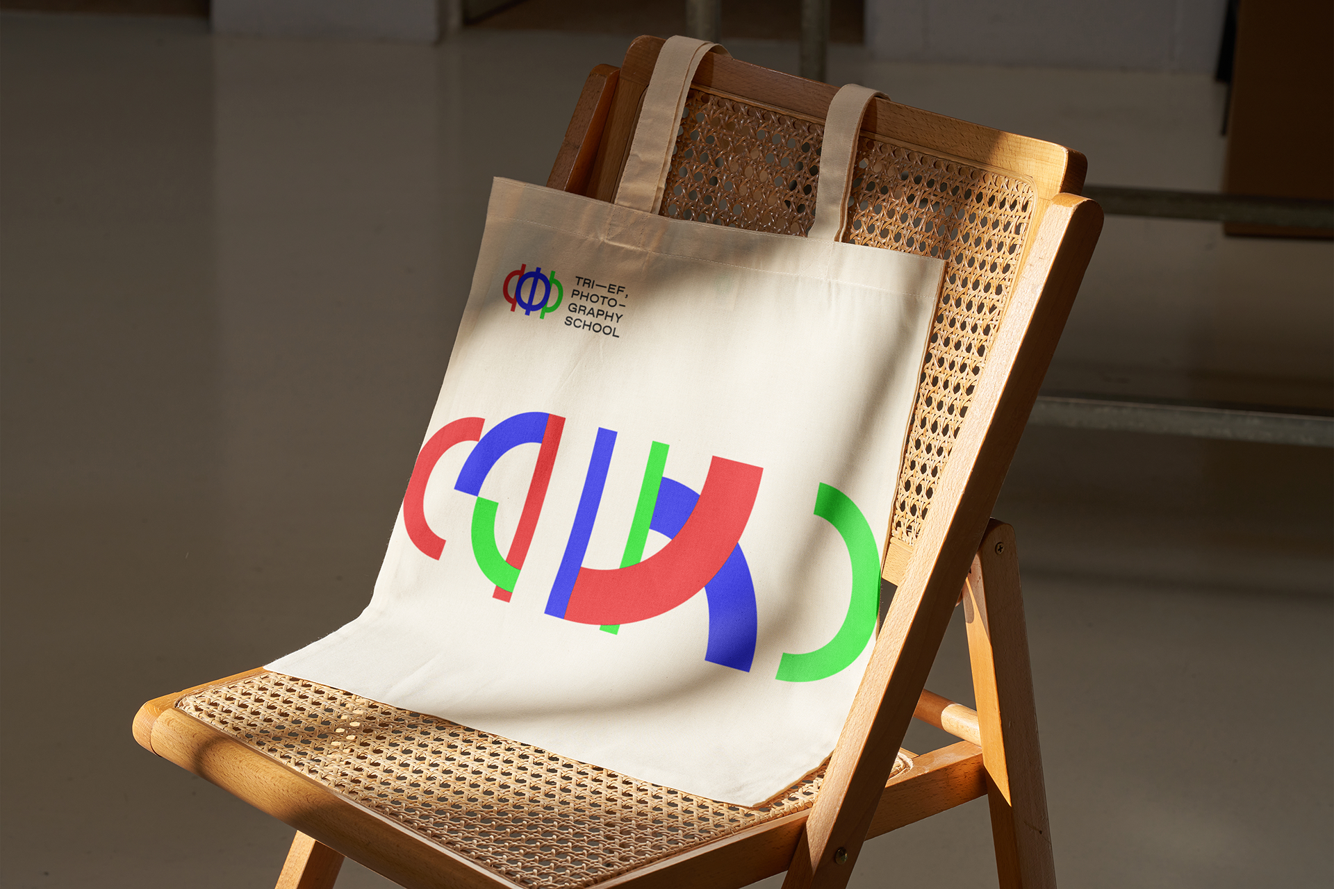
As the school is based in Belgrade (Serbia) where both Cyrillic and Latin alphabets are commonly used, I decided to bring together both alphabets to visualise their ethos. The symbol itself is made of three F (Ф in Cyrillic), which combined create a dynamic and memorable shape. The slight overlapping of the shapes also reminds us of the aperture, the variable opening by which light enters a camera.
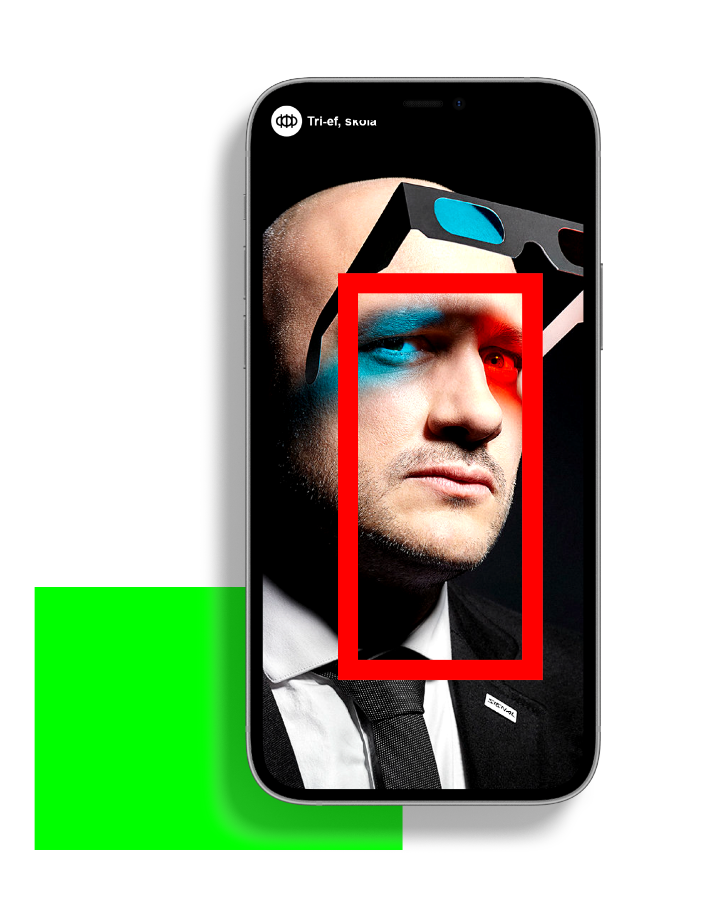
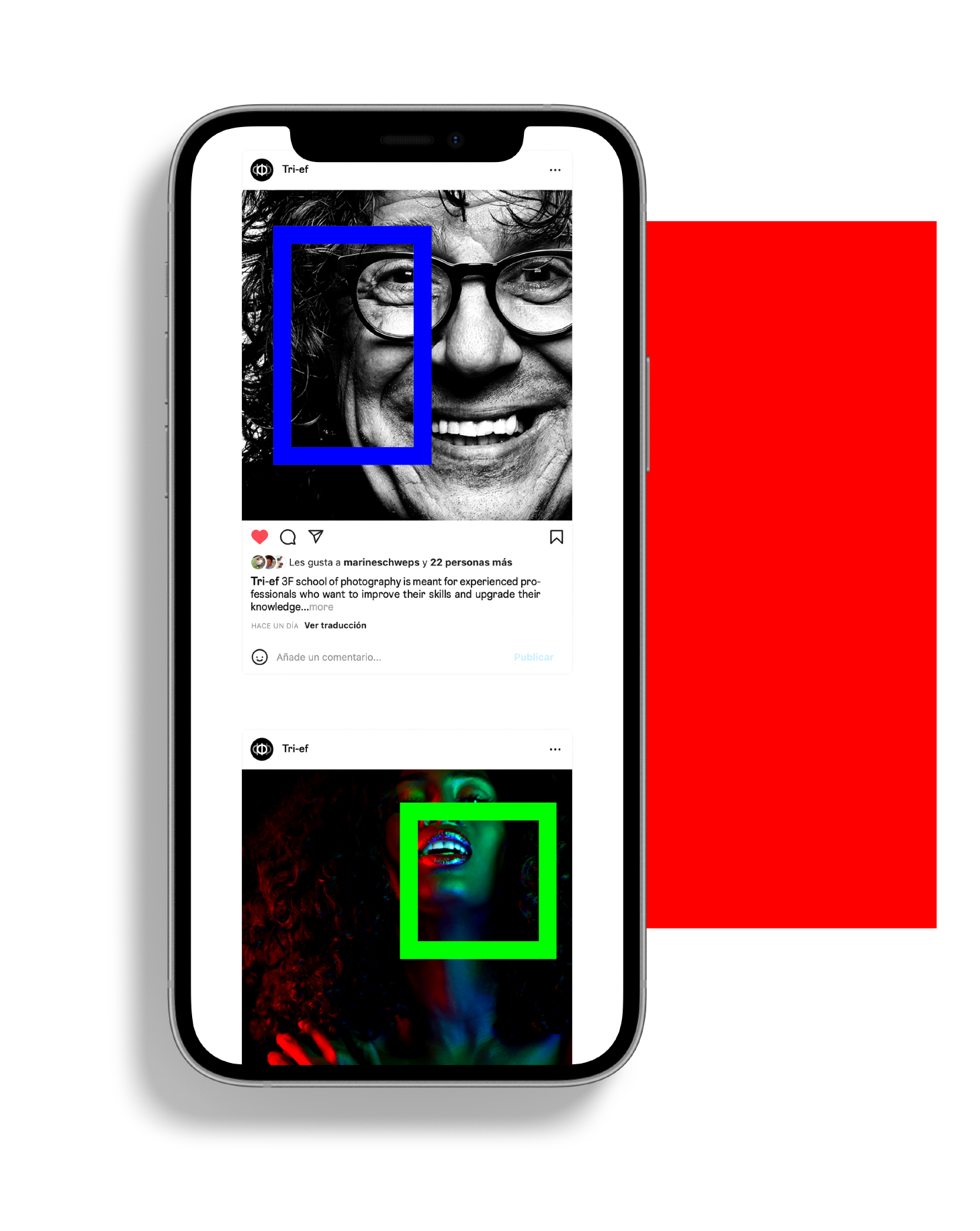
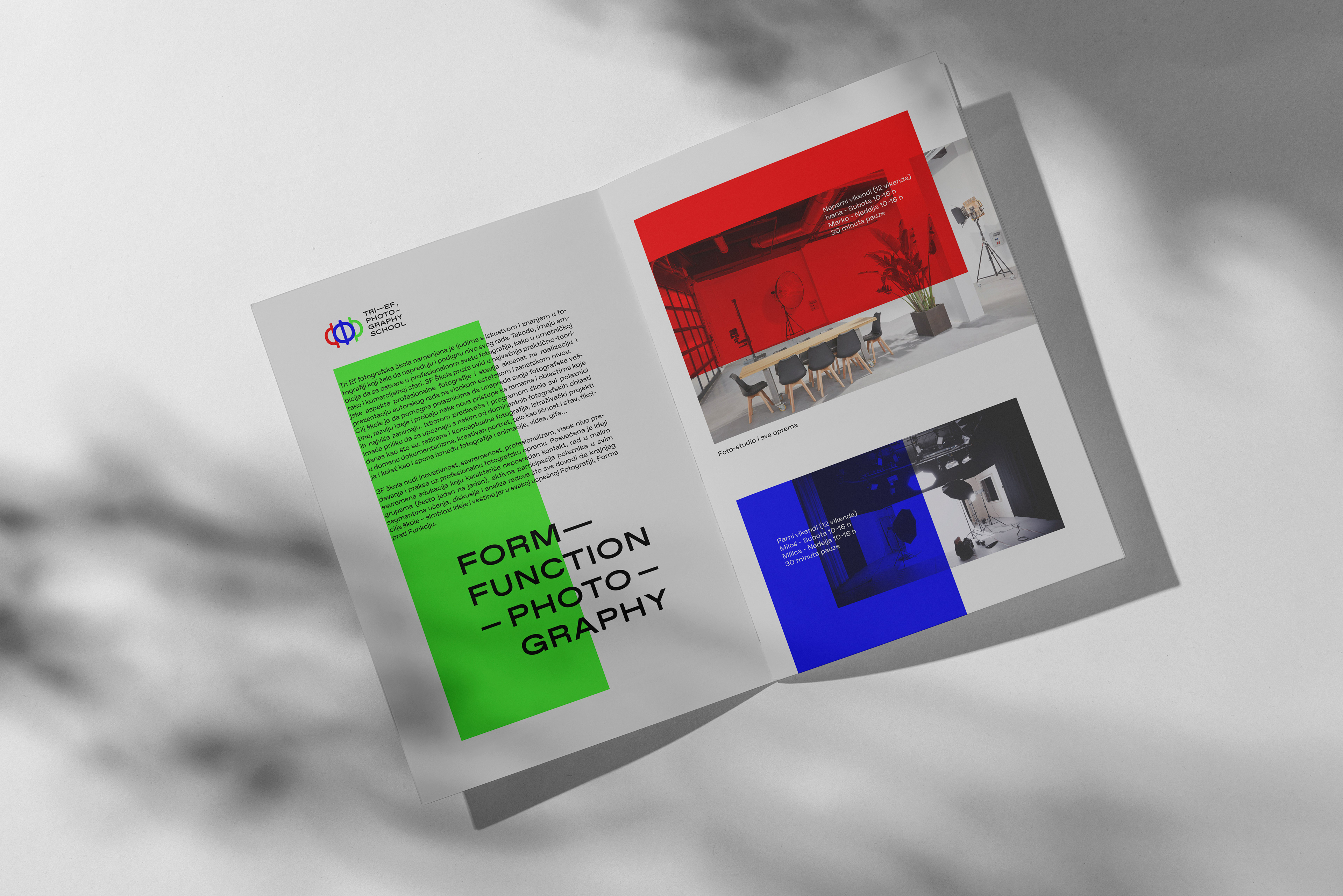
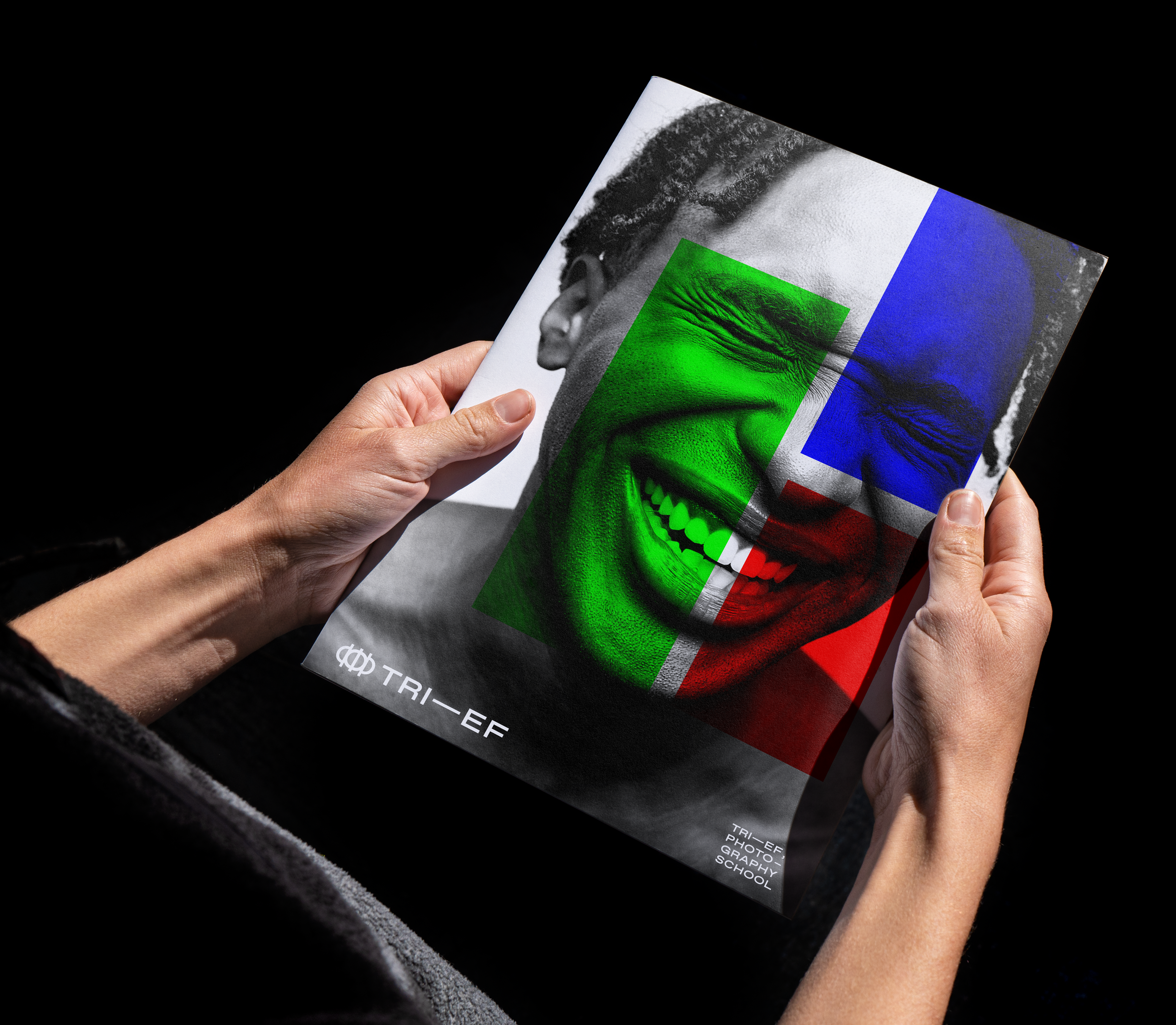
To accompany the logo, I created a grid system using exclusively photo formats (16:9, 16:10, 4:3, 2.35:1… ) and proposed a colour palette made off the three RGB colours: red, green and blue.
All these elements put together helped establish a unique visual language, one which photography lovers will recognise and understand.
